Rebranding and App Icon Design for AppHouseKitchen
AppHouseKitchen
May 2024 to Present
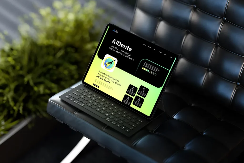
AppHouseKitchen, a young software company near Vienna, required a rebranding and a new app icon for its software solution AlDente, a macOS app designed to extend MacBook battery life. Their goal was to create a visual identity that represents both AppHouseKitchen’s technical affinity and its sustainable approach.

The first step involved a comprehensive analysis of AppHouseKitchen’s existing brand identity and target audience. The objective was to integrate values such as innovation, modernity, efficiency, and longevity into the new visual identity. The design process for the new app icon included several iterations and the use of colors that reflect the brand image and app functionality. After extensive testing, an iconic blue-green gradient was chosen as the brand’s central visual element. This gradient gives the app a modern and appealing look, resonating with both tech-savvy and environmentally conscious users.
Through the rebranding and the new app icon, we helped AppHouseKitchen achieve a fresh, innovative look that clearly sets it apart from the competition. The new design emphasizes the brand’s values of quality and sustainability and establishes a visual link between the app’s technical functionality and its mission to maximize MacBook battery lifespan. The cohesive visual identity strengthens the brand’s presence and enables AppHouseKitchen to effectively reach its target audience and confidently communicate its message.
We are proud to be part of this journey and to have equipped AppHouseKitchen with a visual identity that perfectly communicates its values.
© 2024 Sposato e.U. | Imprint and Privacy Policy
© 2024 Sposato e.U. | Impressum und Datenschutzerklärung